Cute Card Game
Cute Card Game is code for a project that started on July 2018 involving developing a cute anime-styled deck-builder card game. My role on the project was to lead the UI/UX design of the game. I discuss the UI of the game in a post here as well as overall game design, design challenges, and things learned -here-.
⠀
User Experience Design
I am going to focus on a couple select interesting parts of Cute Card Game that went through many iterations through the user experience design process.
⠀
Interaction Design
In Cute Card Game, each card has different resources attached to a card that allows it to have a unique role in your deck. Some cards will also have unique abilities that will trigger on play. The goal of the card design was to create a card that conveys enough meaningful information to the player to act on, without it feeling overbearing and creating a burden them with too much or too little relevant information.
⠀
Initial prototype looked like…
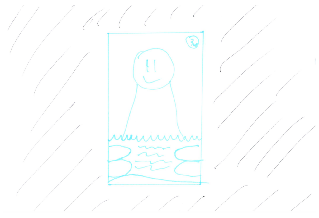
⠀
The issue with this design was that most cards will be thumbnail size on the board state, and the card’s effects and resources were not readable on most screen sizes. This card was modeled how a physical card would look in a digital environment and it did not translate well.
⠀
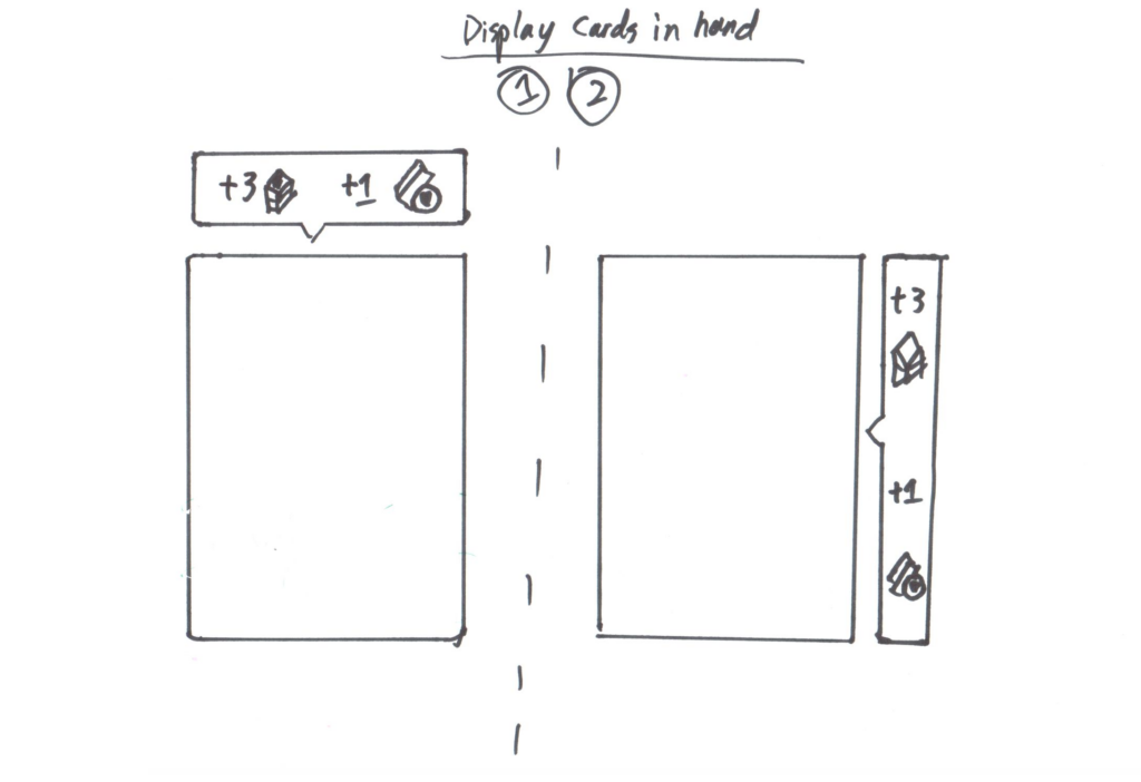
Revised prototypes looked like…
⠀
Whilst the above solutions show the resources allocated to the card, if the card had a unique ability, it did not communicate that at a glance value. Additionally, the contextual on-hover design still required too much work from the user to understand the beneficial resources on the card.
⠀
Prototype 1.0

⠀
In version 1.0 each resource is clearly visible at glance without any additional action. However it made the card feel cramped and difficult to read. I also wanted to give the card a bit more of an identity beyond replicating the card look.
⠀ ⠀
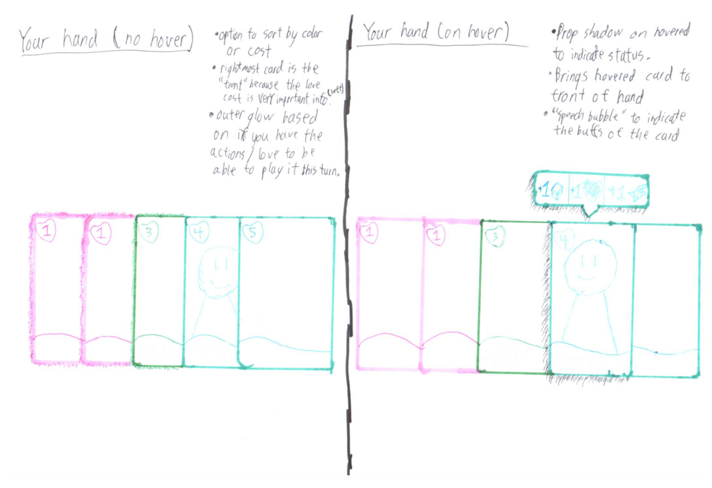
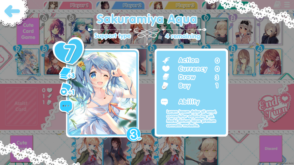
Finalized Card Design

⠀
This final prototype effectively conveys the cost of the card, the card type by color, if or if not it has an ability noted by the chat bubble, and the resources the card grants at glance value. While it does not convey what the ability of the card is, that can be investigated by clicking on the card and seeing a zoomed version of the card below.
⠀ ⠀
Full Screen Card View
⠀
I believe that this is a fair compromise to make in the design. It allows for newer players to have easy access to information they need and gives experienced players less visual clutter to look at to find what they need.
⠀
How cards look and feel are the core component of any card game, and removing as much burden of use from both experienced card game veterans and non gamers was my goal.
⠀
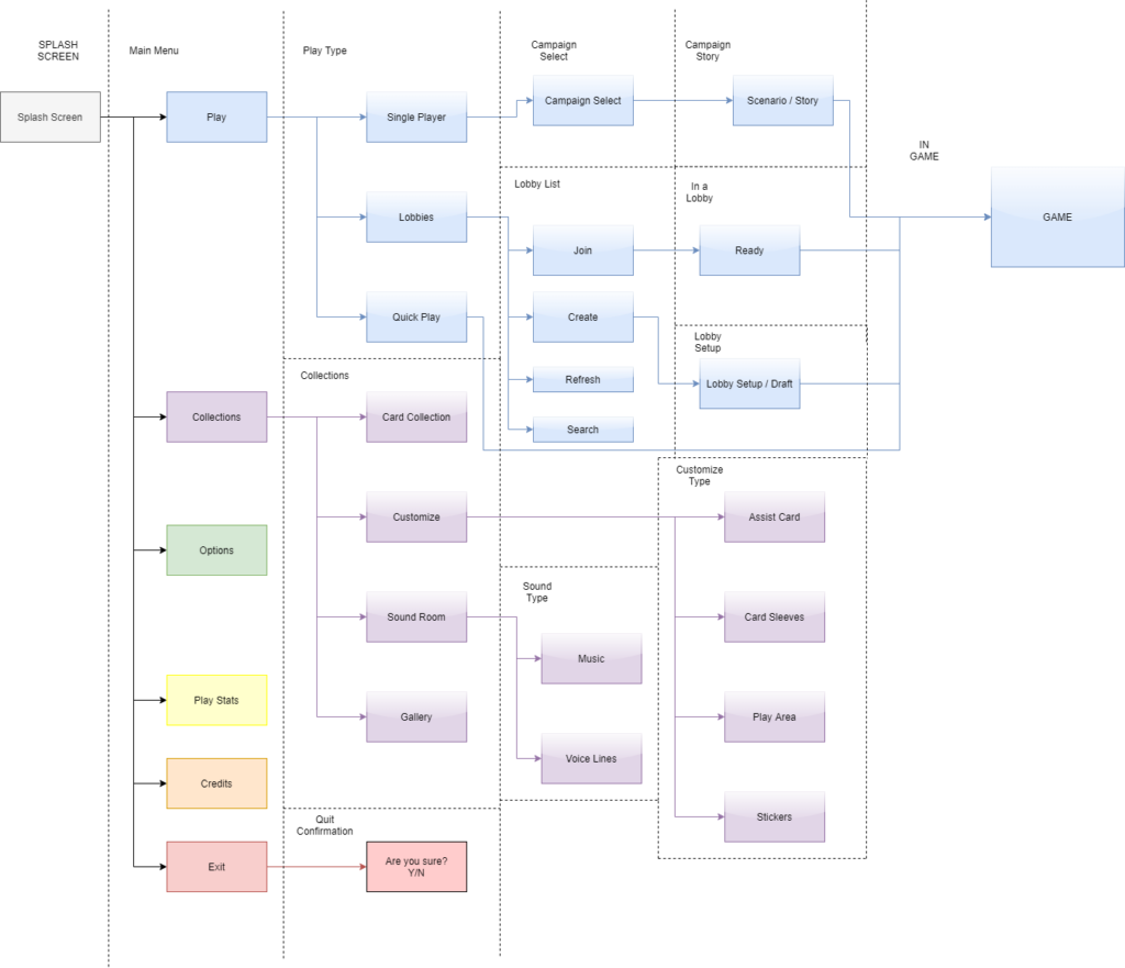
Information Architecture
The goal of the menu architecture is not only to allow a player to reach what they want with the least amount of work as possible but also to meet their expected mental model. The following information architecture chart breaks down the prototype mapping of the menu.